Tuesday 28 August 2012

Front Row Society

So.......

I was contacted a few weeks ago about entering a competition run by Front Row Society to design a scarf. It interested me because the theme was that you have to take an element, earth, fire, air, water, etc, and make it show your personality, reflect yourself within the design.

I straight-away without having to think about it decided on water. Mainly because it is an element that seems to be ruling my life right now...as it has been constantly raining most of the summer! I also think it best suits my personality, for reasons which I find hard to explain!

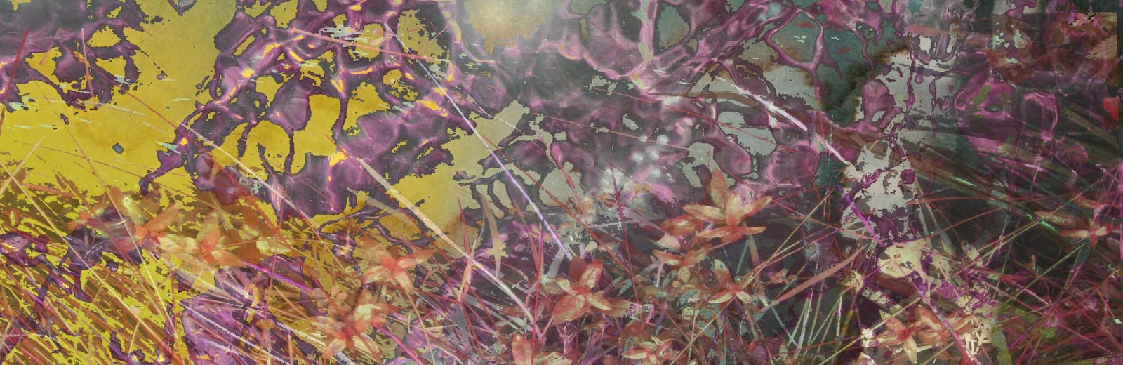
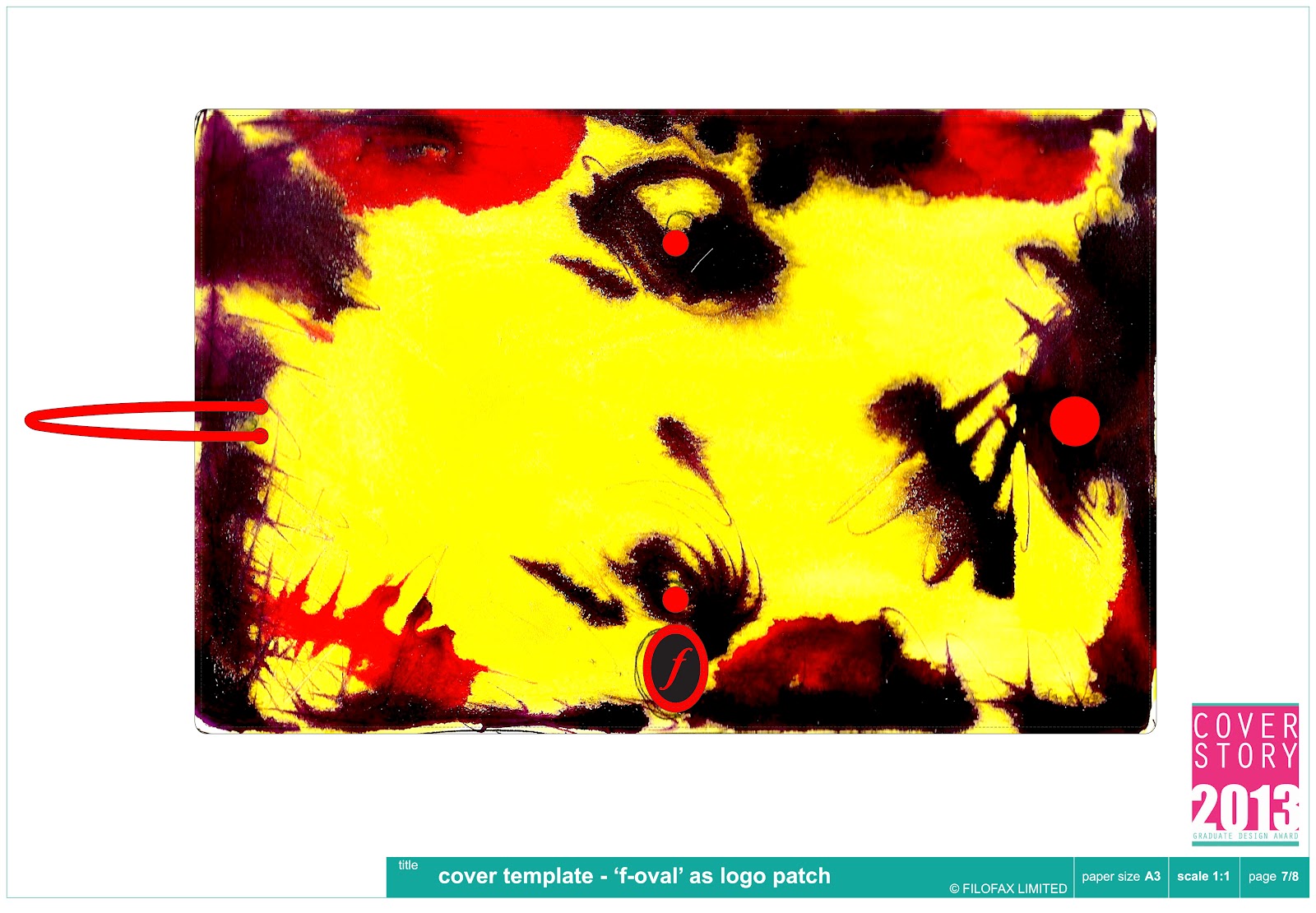
After a long time of designing, throwing things in the bin, and designing again, I came up with the idea of combining photography with my ink drawings.

Although I did not complete it in time to enter the competition, I am proud of the results that I eventually settled on! Front Row Society are continually running competitions so I hope to enter lots more in the future.


Musgrove Park Hospital Commission

So.......

After my end of year show that became my first blog, I was awarded a commission by the local Taunton hospital to create a piece for the Endocrinology (apologises for the spelling!) department.

After meeting with the co-ordinator last week I've now got a very clear idea what they are looking for. A piece at the end of a corridor where staff can take time to discuss issues, or to learn from magazines, etc. A respite place perhaps.

Here are my first few ideas about what to do with the space. It is strongly lit by daylight for most of the day but moves into shadow further into the room.


Watch this space for more developments on this!!

Commission!

So.......

I received one of my first commissions as an artist and wanted to share this excitement! A private commission, my client had viewed my website and loved my drawings, and requested some versions of  some of my monochrome drawings with her own specific colours. The colour palette was very dark and sophisticated, khaki greens, petrol blues, dark browns like oil on water. Here are the final results, I am very pleased with the outcomes and hope my client agrees.

Iceflow:


Inks:
Tributaries:


If you're interested in any commissions feel free to contact me at: polly_taylor@hotmail.co.uk

Friday 17 August 2012

Recent designers/trends that inspire me...

So.......

I generally try and keep an idea out for new designers, trends, ideas that inspire me, so thought I'd do a quick blog about some that have caught my eye recently.

This is a scarf design by the very talented graphic designer, artist, and illustrator Joan Tarrago. her website: www.joantarrago.com


I love the colours! Here's the layout of the design:

Beautiful! 

I have always admired the work of this designer, Christian Zuzunaga, (as well as his extraordinary name!) 


He takes images of cityscapes then blows then up much that they become pixels, pure squares of colour. This makes the foundation of his designs. I love this idea, that what you're looking at is actually part of a much larger image, larger than the sofa or bed, even the room they are in. 

Pippa Jameson has a great blog for interior ideas and trends. Here's her mood board on grey and mustard, a colour combination that I am also a big fan of!


Her blog can be found at: http://www.pippajamesoninteriors.co.uk/

I love Designers Guild because they are always pushing boundaries of what is 'commercial', or 'popular'. They use colour and pattern boldly and aren't afraid of being innovative. Here is their collection designed by Christian Lacroix, just beautiful!


If I had the money....!

It's hard not to be inspired by that lot I think! On to the next idea. :)

Wednesday 15 August 2012

Shoply

As well as an Etsy site, I've also recently opened a shop on a newer site called Shoply, which, although not as established, is fresh and full of energy for new design talent.

I'm very pleased pleased to say I have been chosen to feature on their News section! Here's the link, please check it out :)

http://shoply.com/news/featured-shop/polly-taylor-designs-interview/

Thursday 9 August 2012

Filofax Competition

So.......

I've entered another competition!

This one is for Filofax, the well-known organiser brand...! The brief was to create a new, fresh design for women, to be part of their launch in Spring, so it must be within keeping of the season.

So I got my inks out as usual....and here's the results:


I decided to use this scribbly technique with the inks to look kind of like scribbly writing.


Stripes, a classic! But I don't think the colour is feminine enough.


Stripes the other way up, with hopefully more feminine colours. Think I prefer them that way round. 

Colour in an asymmetrical shape, similar to my Absolut designs.


This is one of my favourites, but I'm not sure how commercial it is. Also the colours get a little grubby where they merge.


Very bright and spring-like, but perhaps again not feminine enough.


I like this one because it reminds me of Himalayan Balsam, that plant that explodes in your hand. Perhaps too dark though.


I like this one, it is both Spring-like AND feminine!


My Dad doesn't like this one, but I do! I like the blue/orange combination. But not very Spring-y.


Again with the scribbles.


This one seems to be the most popular! I like the bright green on top of the stripes. I'm not sure which ones I'll submit yet...hard to decide! But it will definitely be this one.