I've entered another competition!
This one is for Filofax, the well-known organiser brand...! The brief was to create a new, fresh design for women, to be part of their launch in Spring, so it must be within keeping of the season.
So I got my inks out as usual....and here's the results:
I decided to use this scribbly technique with the inks to look kind of like scribbly writing.
Stripes, a classic! But I don't think the colour is feminine enough.
Stripes the other way up, with hopefully more feminine colours. Think I prefer them that way round.
Colour in an asymmetrical shape, similar to my Absolut designs.
Very bright and spring-like, but perhaps again not feminine enough.
I like this one because it reminds me of Himalayan Balsam, that plant that explodes in your hand. Perhaps too dark though.
I like this one, it is both Spring-like AND feminine!
My Dad doesn't like this one, but I do! I like the blue/orange combination. But not very Spring-y.
Again with the scribbles.
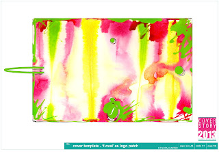
This one seems to be the most popular! I like the bright green on top of the stripes. I'm not sure which ones I'll submit yet...hard to decide! But it will definitely be this one.


No comments:
Post a Comment